Separate the main message from detail
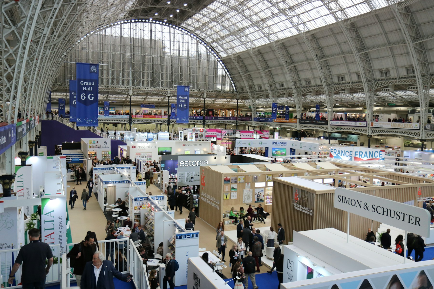
Someone passing your stand does not read it like a website. They first notice a large surface, an image and a few words. Write a short statement for that situation, explaining the problem you solve or the audience your product serves. An unfamiliar brand name alone usually does not answer that question.
Put technical specifications and detailed advantages on a second level that people can read at close range. If every line has the same visual weight, there is no reading order. Leave space around the main statement so it can stand apart from exhibits and neighbouring stands.
Test at the intended size
Print a section at its proposed size or mark the intended area on a wall. View it from different directions and approximately the distance at which visitors will first see your stand. Five metres is a useful test point, not a universal legibility standard. Aisle width, lighting and the actual installation position change the result.
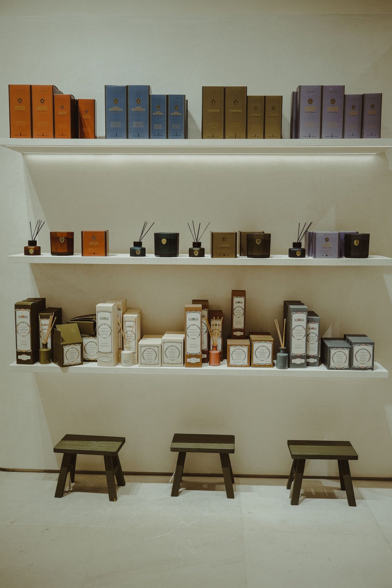
Look for strong contrast and calm backgrounds. Small lettering over a busy photograph may work on a monitor but disappear in an exhibition hall. Also check whether a screen, shelf or open cupboard will later cover part of the message. An unobstructed design file does not establish a clear finished display.
Test understanding with an outsider
Show the draft briefly to someone unfamiliar with your offer. Ask what they think the business provides. Asking whether they like the design tells you less than this simple comprehension check. If their answer is far from the intended offer, change the wording before adjusting decorative details.
A bilingual sign needs enough space for both versions. Two full advertising paragraphs in smaller type are rarely the strongest answer. Use concise statements with equivalent meaning and test each separately. The language may change, but product names, numbers and the scope of your claims should remain consistent across the two versions.